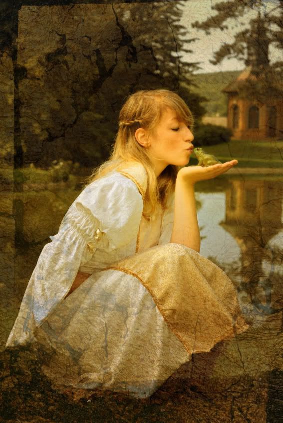
+of+rosie+796.jpg) Okay... I gotta do this quickly...I need some new business cards! This is design #1
Okay... I gotta do this quickly...I need some new business cards! This is design #1 I was playing around today and came up with these....This is #2
 And finally...design #3.
There is a poll on the side bar there, please vote on your pick! Hope your weekend was fabulous.
************Okay guys! (update) I know they are 'busy' just tryin' to find out step by step what might be lovely...I know I can count on you guys to vote!*********refine each one..I value your opinions!!***********=P
Sunday, October 28, 2007
Business Cards Poll
Shared by
BellaColle
at
6:01 PM
![]()
Subscribe to:
Post Comments (Atom)


8 comments:
We love all of them, but mmm...mmm...maybe we would go with number one!
blessings,
kari & kijsa
i like them all, but number 2 way out in front for me, I have to say 2 and 3 remind me of you and your gorgeous work, they tell me queenie.
Love always
duchess of delightfullness
karaxx
I like number 2. I think it's the easiest to read. But I like all of them.
Love,
Julie
Hi Christine! You are working too hard :) I voted. And I want to know how to add those filigree borders like you do...what program do you use?
I love number 1 and 3! I think they are all gorgeous!!!
If you are worried that they are too busy, try to make the background transparent- should be a way to do that in your software. Then your info/words on top will stand out more. That may help you feel better about them, but they really do look great!
i voted #1....but #2 could possibly be my fave if the black were chocolate brown instead. =)
great work! =)
You're amazing! How in the world do you manage to add a POLL to your blog, design 3 business cards and be so on top of things?! I like number 2 but after I voted, I decided that I'm tied on 2 and 3. Not much help, sorry. Blessings... Polly
I like different things about all of your cards, but I'd go with #1. Maybe taking the opacity of the background down a notch would draw focus more immediately on the type. Can't wait to see what you end up with.
Monica
Post a Comment